历届奥运会会徽及含义(1932-1976)
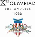
Los Angeles 1932 Emblem 洛杉矶奥运五环登上会徽
 It is composed of the American flag presented in the form of arms, accompanied, in the foreground, by the Olympic rings, the Olympic motto "Citius, Altius, Fortius" (faster, higher, stronger) and a laurel branch, symbol of victory.
在盾形的星条旗前方,“更快、更高、更强”的奥林匹克格言号召着运动员奋力向上,代表胜利的橄榄枝条缠绕在奥运五环上,强化了本届会徽的竞争意义。
Berlin 1936 Emblem 柏林纳粹猖獗奥运受辱
It was created purely by chance- an artist, Johannes Boehland, started by  designing an emblem containing the five Olympic rings with a superimposed eagle and the Brandenburg Gate, one of the symbols of the city. However, the President of the Games Organising Committee, Dr Lewald, was not satisfied with this composition and took the initiative to open the bottom part of the emblem, which turned the design into a bell. Although it was purely by chance that it was created, the symbolism of this figure was immediately recognised.
1936年柏林奥运会也因此成为希特勒领导的纳粹宣扬雅利安种族优越性、粉饰战争企图的舞台。会徽中,一只纳粹党徽上的普鲁士鹰昂然站立在被扭曲的奥运五环之上,象征着德意志帝国绝对的霸权与征服。在鹰与五环的外围,设计师本来以柏林标志的勃兰登堡门作为装饰,但奥运组委会高层并不喜欢拱门的开放底部,强行要求设计师更改设计。最后,一只奥林匹克钟取代了勃兰登堡门,钟的边缘部分用德文写道:“我召集全世界的年轻一代”,昭示了德国法西斯借奥运会向全世界宣扬纳粹思想的险恶用心。
London 1948 Emblem 伦敦战争影响奥运倒退
 It is composed of the clock tower of the Houses of Parliament. The hands of the famous "Big Ben" are pointing to 4 o'clock, the time at which the opening of the Games was planned. In the foreground, the Olympic rings. The Games Organising Committee wanted a typically English emblem, but one that would have significance not only for the generation of that time, but for future generations as well.
1940年和1944年两届奥运会受第二次世界大战的影响而停办,在12年的等待后,来自世界各地的运动员在1948年相聚伦敦。著名的“大本钟”取代了巴黎市徽,奥运五环标志似乎是这届会徽惟一的现代象征。在会徽上,大本钟的指针指向4点钟,这也是本届奥运会的开幕时间。
 Helsinki 1952 Emblem 赫尔辛基标枪之国纪念英雄
It was composed of the tower of the stadium with the Olympic rings at the top. It was worn as a badge by the dignitaries and VIP guests at the Games.
本届奥运会徽也以赫尔辛基内体育场内的白塔作为主题。在奥运会期间,会徽则仅被组委会制作成小徽章,用于标明佩戴者的贵宾身份。#p#
Melbourne 1956 Emblem 墨尔本与斯德哥尔摩现代与古典的碰撞
 It is composed of a drawing of Australia, with a torch and Olympic rings superimposed. In the bottom half, the inscription "MELBOURNE 1956", extended on each side by laurel branches.
1956年,奥运会首次来到南半球,在澳大利亚的墨尔本举行。椭圆形跑道的会徽造型突破了以往会徽的矩形边框,鲜亮的绿色透露出勃勃生机。在橄榄枝花环的映衬下,奥林匹克的圣火在澳洲大陆上点燃,在奥林匹克五环下燃烧。
 Rome 1960 Emblem 罗马母狼养育罗马国王
It is made up of the Olympic rings above a Roman she-wolf, from which Remus and Romulus are suckling. They are the twin brothers who, according to legend, founded the city of Rome. Between them, is the date, 1960, written in roman numerals.
罗马城的象征为一只母狼哺乳两个婴儿的青铜像。1960年罗马奥运会徽的主要标志就是以“母狼育婴雕像”作为素材。在“母狼育婴雕像”下方,五环代表了奥运会的到来,罗马数字1960标明了举办时间。
Tokyo 1964 Emblem 东京会徽设计的里程碑
 It is composed of the Olympic rings superimposed on the emblem of the Japanese national flag, representing the rising sun. Having examined a large number of proposals, the Games Organising Committee chose the design submitted by Yusaku Kamekura which was subsequently accepted as the official emblem of the Games.
本届的会徽带有显著的地域烙印,会徽下方“东京1964”的字样标明了奥运会举办的时间和地点,会徽正中由金色奥运五环托起的日本国旗太阳图案十分醒目,昭示着日本想借奥运会的机遇重新振兴国家的心情。
Mexico 1968 Emblem 墨西哥文化底蕴现代表现
It is a combination of the five Olympic rings and the year. The design came from the collaboration of three artists: Pedro Ramirez Vazquez, architect and President of the Organising Committee for the Games, Eduardo Terrazas (MEX) and Lance Wyman (USA). It recalls the patterns of the Huichole Indians.
本届奥运会会徽设计出自一个3个团队之手。设计师在会徽的造型上借鉴了墨西哥古代雕刻的线条排列方法,使会徽在最现代的表现手法深层也带有浓郁的地域文化韵味,这种手法最直接地宣告了本届奥运会的举办地。
Munich 1972 Emblem 慕尼黑无限“宇宙”透出新意
 It represents a crown of rays of light, a design symbolizing the spirit of the Munich Games- light, freshness, generosity, expressed by the design "Radiant Munich". It was created by Otl Aicher.
本届会徽是一个被称做“宇宙”的螺旋体,这个运动感十足的符号营造出一种接近无限的视觉幻想,表达出本届奥运会“光明、清新、慷慨”的主题。
 Montreal 1976 Emblem 蒙特利尔简约风格返璞归真
It is made up of the Olympic rings mounted on an Olympic podium, which is also the graphic interpretation of the letter M, the initial of Montreal. In the centre, the athletics track, the focal point of the Games.This emblem invokes the universal fraternity offered by the Olympic Ideal, as well as the glory of the winners, the gallant spirit of their battles and the accession of Montreal to the rank of Olympic city.
加拿大人用返璞归真的简约设计体现了他们的创意。本届会徽以加拿大国旗的红色作为基调,在造型上结合了体育场跑道与领奖台造型的元素。这个会徽调用了奥林匹克理想的全部内涵,包含了对运动员拼搏精神的鼓励、对胜利者荣誉的崇敬及主办城市的印记。